Hey Everyone,
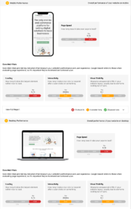
We're making some exciting changes to how we display information within the various sections of the Snapshot Report, and one of those sections will be the Website section. We currently have 3 design ideas that we'd love to get your feedback on. I've broken each one out down below, and your feedback will help shape how this section will look.
Design Idea #1
This design would keep a very similar look to how it currently appears, but simplify the information to help make the data clearer and more visually appealing.

Design Idea #2
This design would add each section to a separate tab, allowing you to switch back and forth between Mobile Performance and Desktop Performance. This would shorten the amount of space this takes up within the Snapshot itself while allowing you to focus on each section separately by using the tabs at the top.

Design Idea #3
This final design combines both mobile and desktop performance into a single card. This would allow you to showcase the data together while still cutting down on the amount of scrollable area.

Don't hesitate to let us know which ones you like or don't like, what works about them, and any questions you have on these future changes.
I love the work being done on the Snap Shot Report. I am stuck somewhere between 1 and 3. I think that I will go with 3. I like it on the same page and not needing to switch back and forth in tabs.
I do like the third with both mobile and desktop viewable together
Love the fresh designs. 3 is my favourite. I know we send the reports digitally but some of my clients prefer a PDF version. I can generate a PDF version ok but the report does not render correctly. Can this be looked at too?
The third mock up is by far my favourite! Like Paul, I would love to see updates to the PDF versions. They display strangely and are honestly hard to look at.
Thanks everyone on your feedback so far! Seems that design #3 is becoming the front runner for our potential changes to the website section.
I also want to thank you for bringing up the PDF concerns you're seeing. I'll definitely relay that back to the team to look into as we want to ensure it's as useful as the digital version.
#3 Design is my vote! And I agree with the previous PDF comments!
